Project
Roppongi
Client
Taiko Group
Year
2025
Scope of work
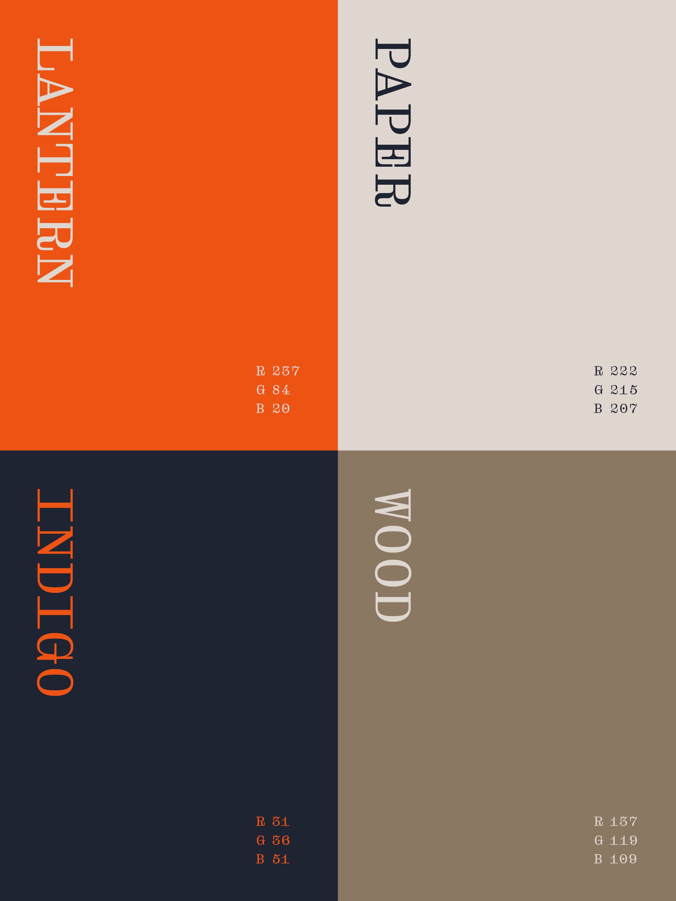
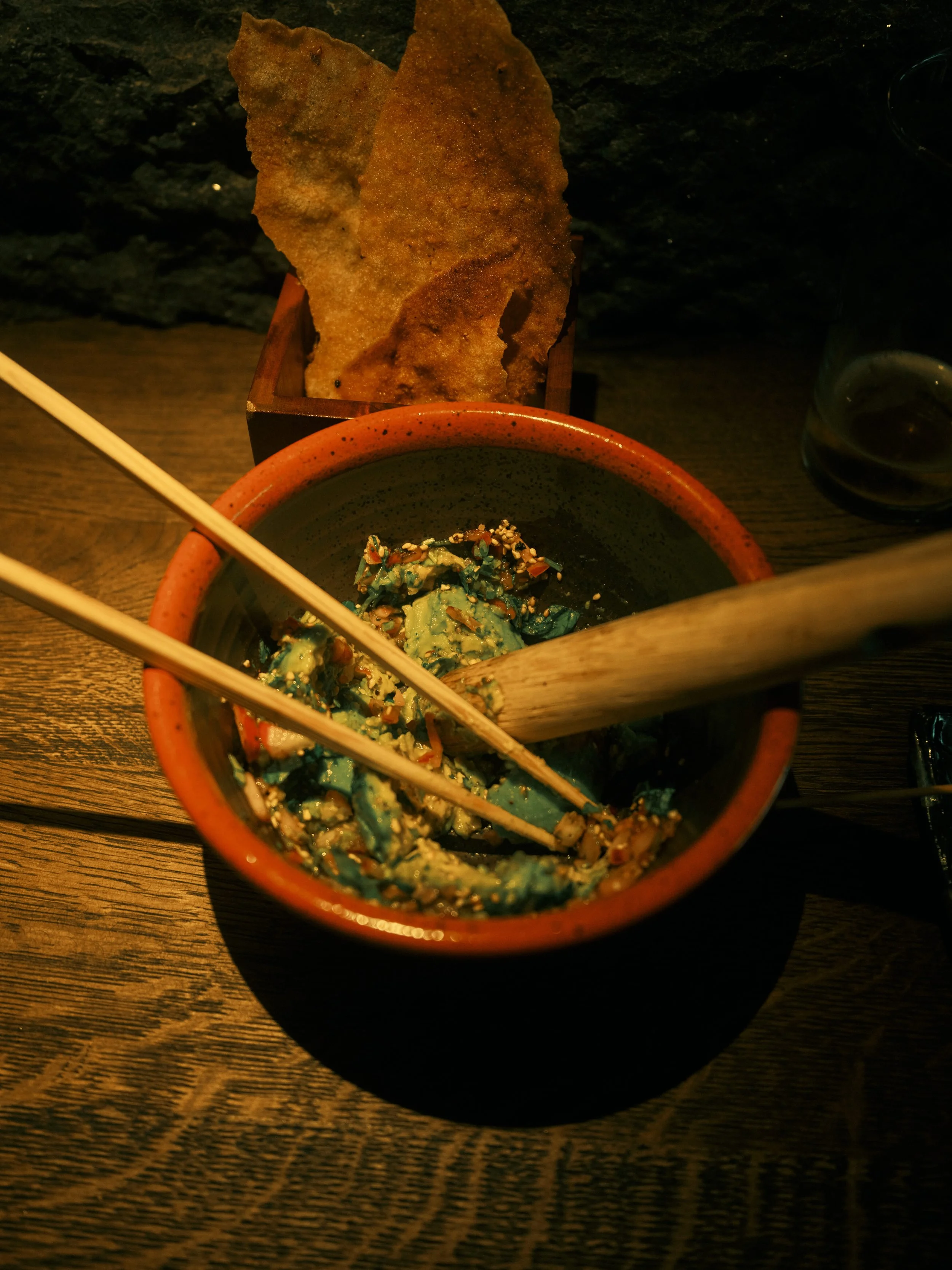
Visual Identity, Tone of voice, Imagery, Illustrations & Signage
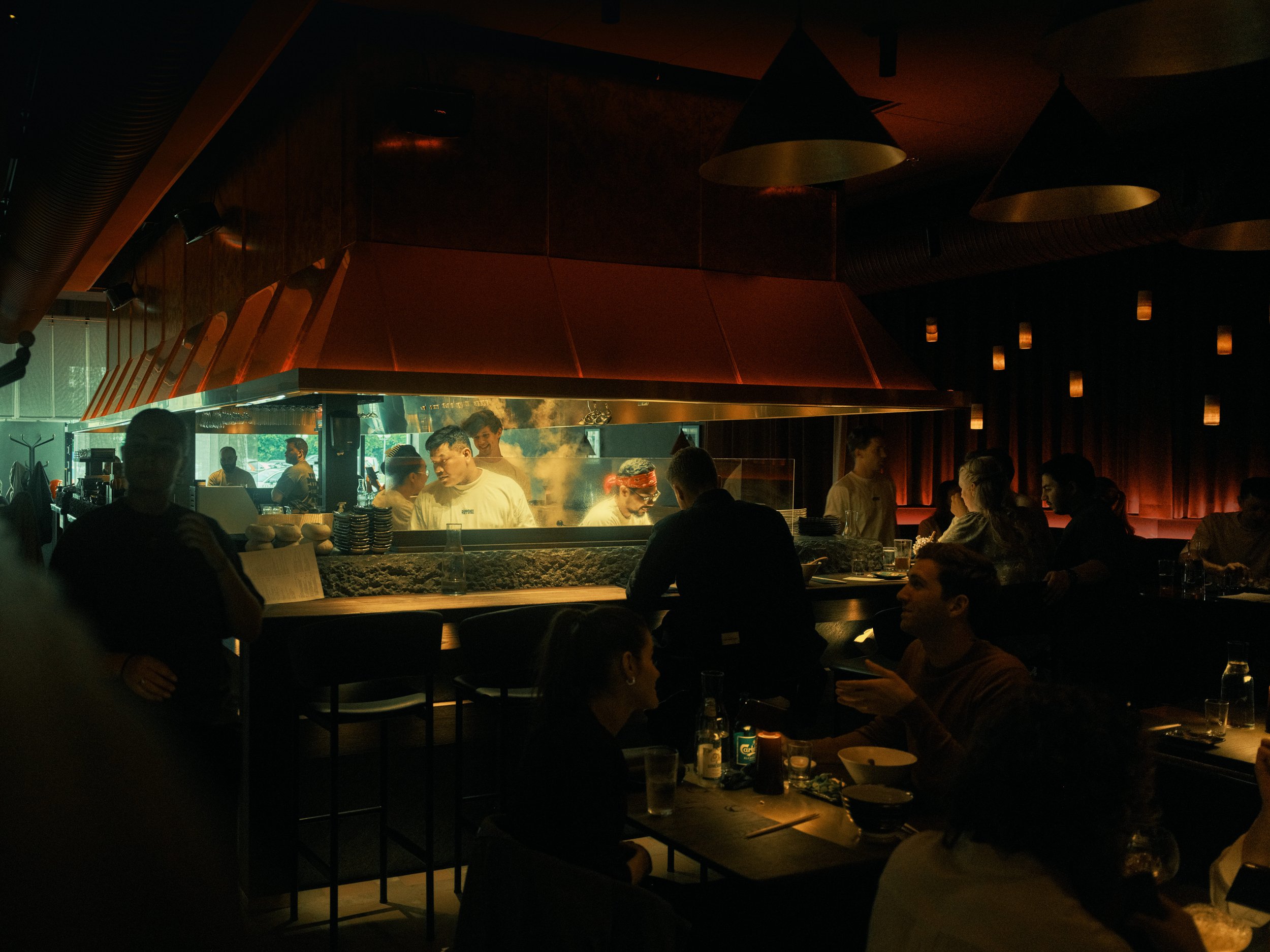
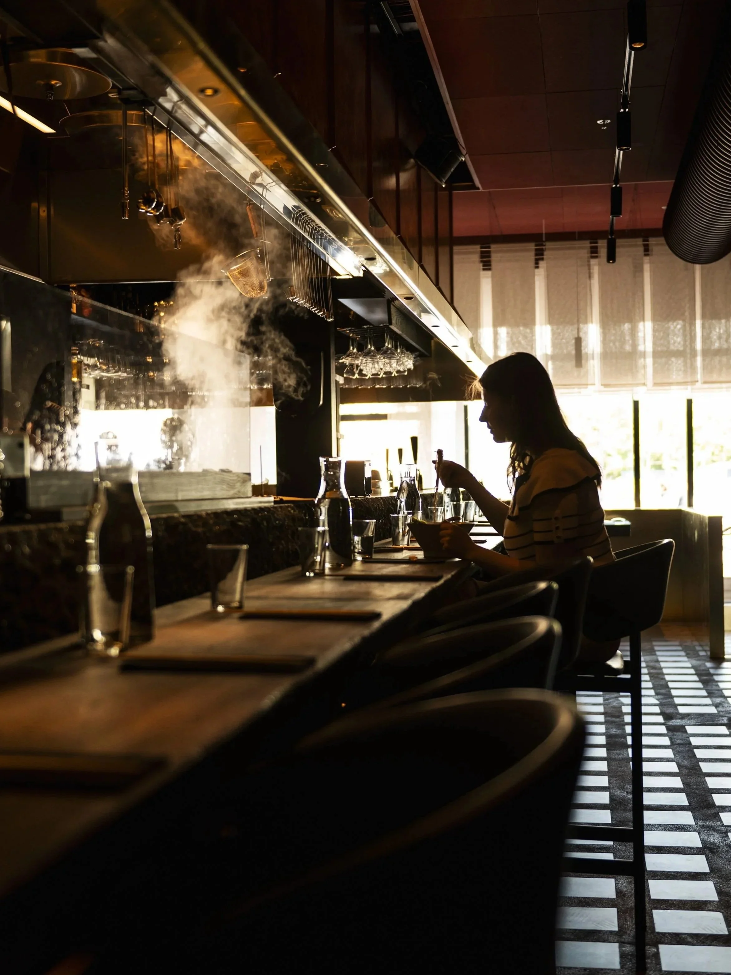
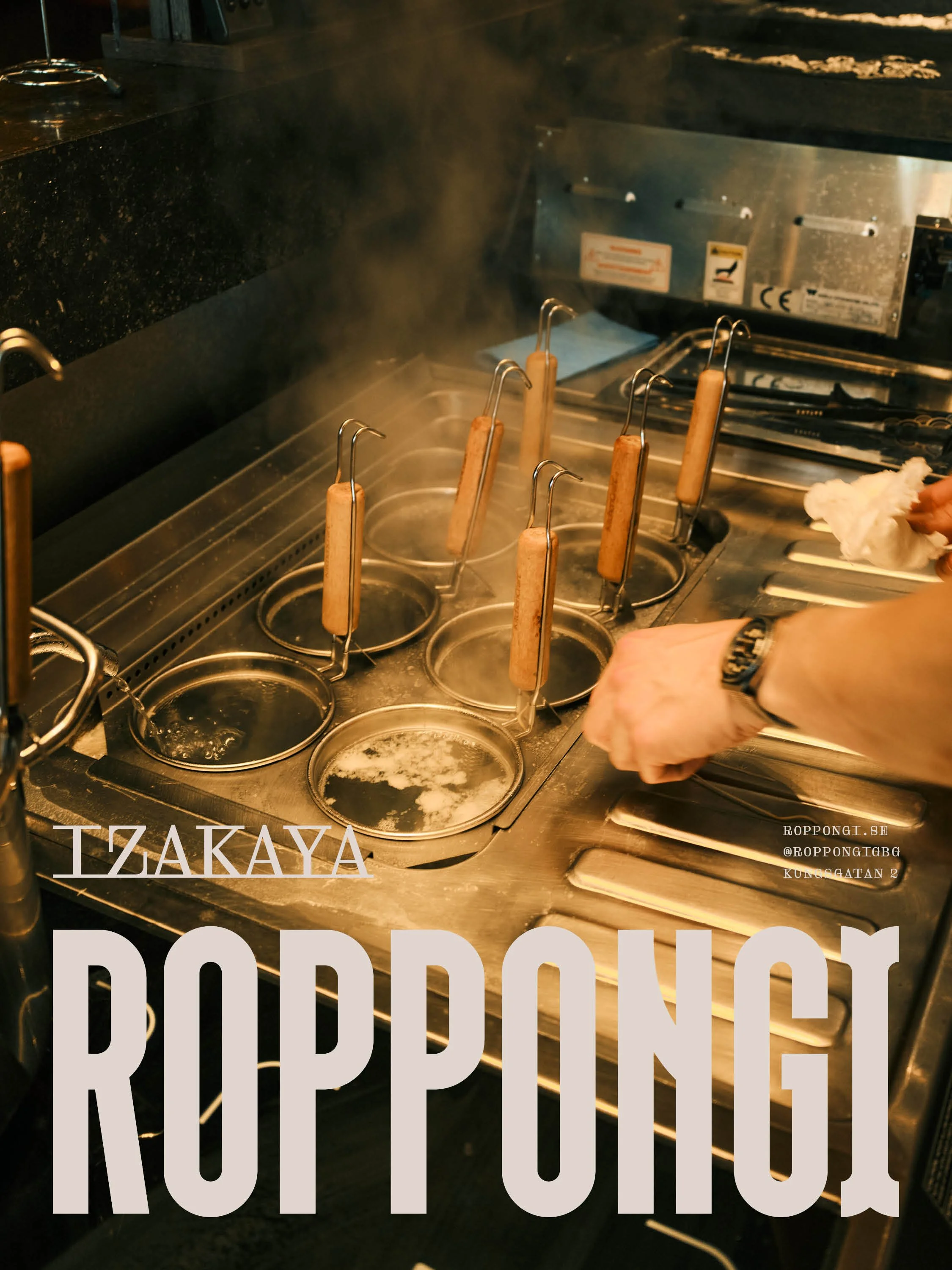
A sizzling nugget of Tokyo in the center of Gothenburg
The restaurant borrows its name from Tokyo's Roppongi district, known for its bars and nightlife. In Japanese, the word means "six trees," and that idea runs through the identity: roots and canopy in the logo, and a seal where the tree-shaped letterform repeats six times.
The illustrations have the hand-drawn feel of calligraphy, paired with a bold visual style that carries the energy of a night out.
Photo: Carl Stavfel Engberg & Ellika Henrikson